A branding campaign for a Property Management and Real Estate company which integrates accessibility, eloquence, and a customer oriented service. It includes a logo, brochure, stationary, and brand guide.


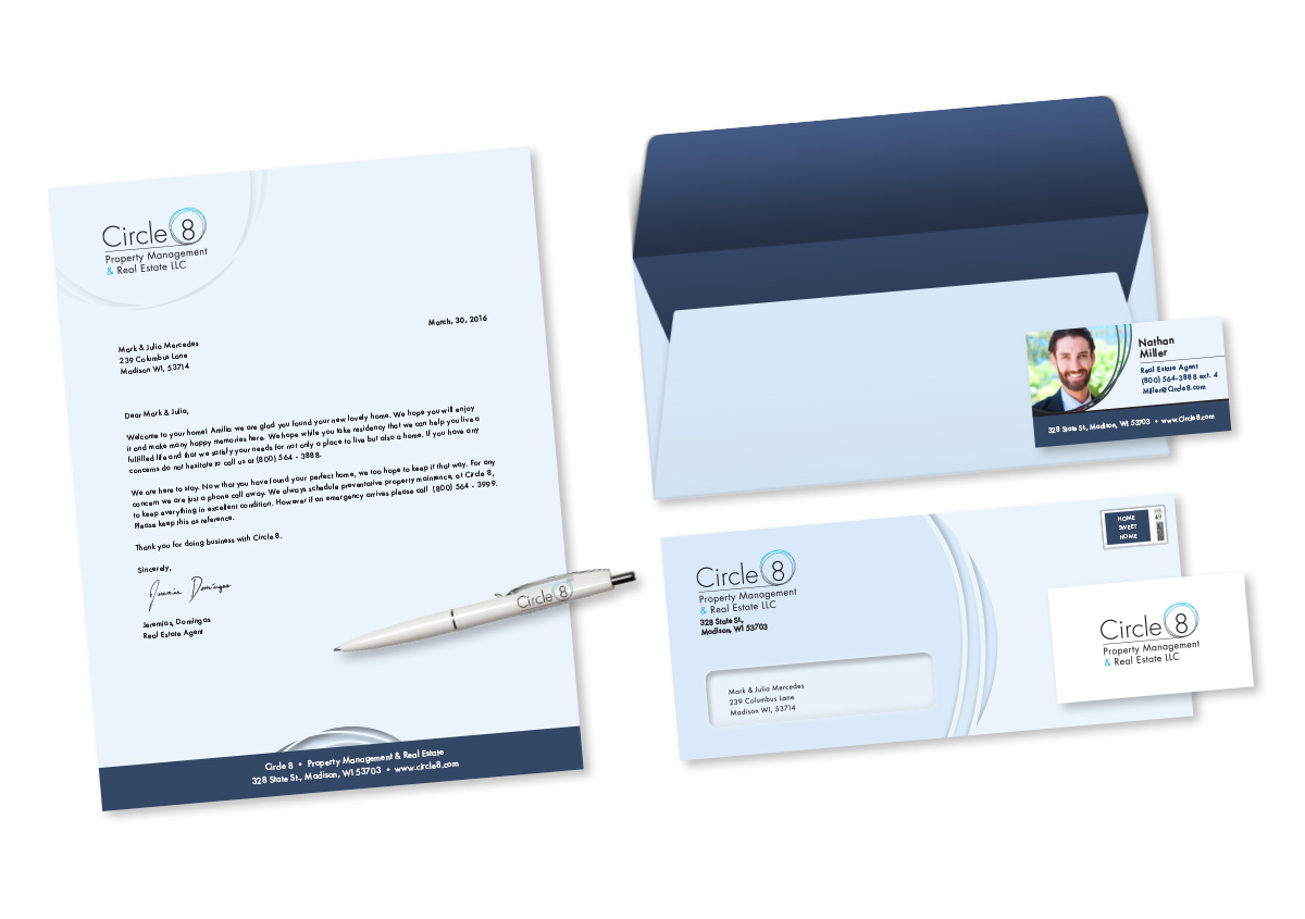
A standard request for any company, this set compliments the brand by consistently using their two main colors and a similar look and feel in each piece.
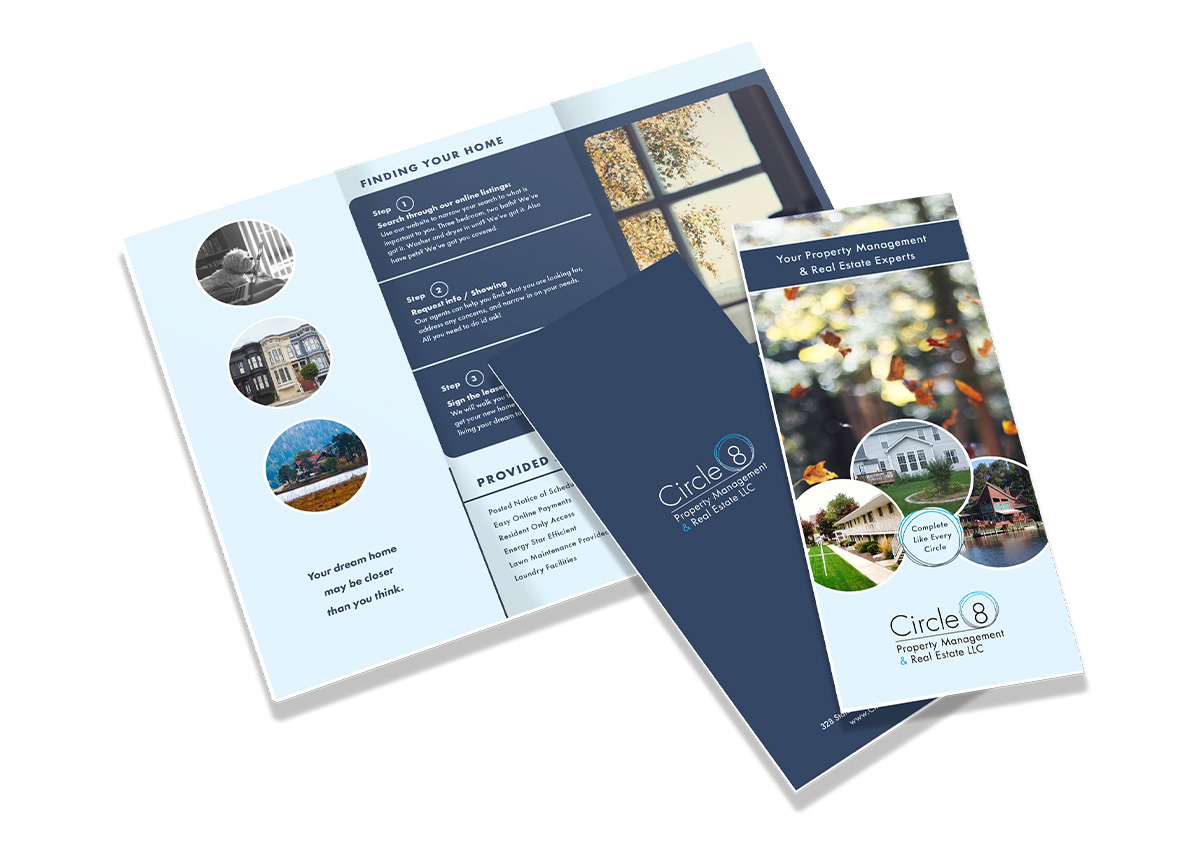
A brochure highlighting what Circle 8 can do for the customer in a concise and organized handout.
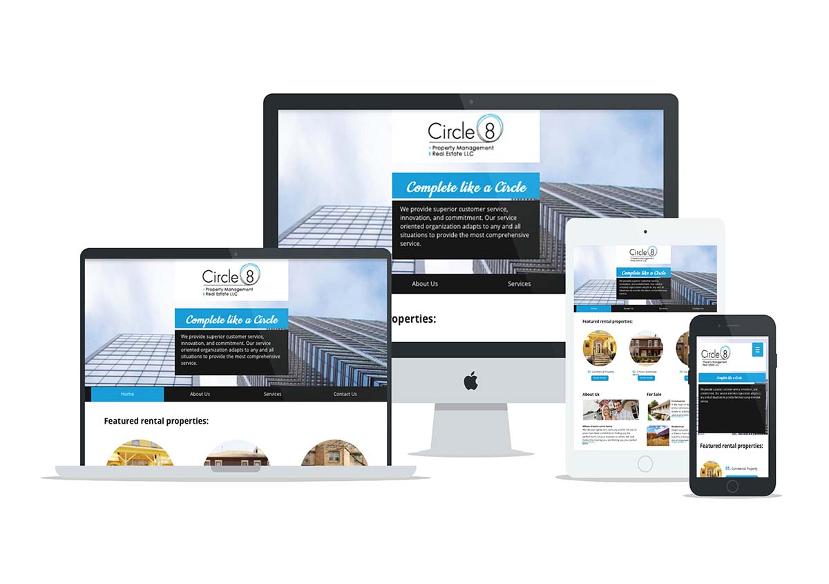
This is a simple website put together in a short amount of time to showcase that websites can be professional and efficient.
This logo is designed to be professional, easily legible and a combination of both a pictorial mark and wordmark. Multiple fonts were tested before settling on the cohesive result.
Copyright © 2022 Brenda Crisafulli Designs · All Rights Reserved
![]()
![]()
![]()