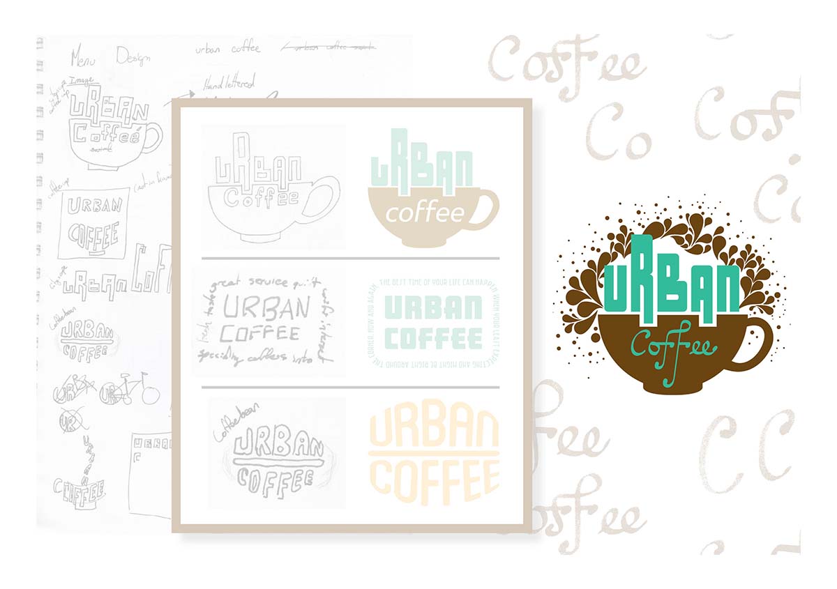
Original concept and design for Urban Coffee embodies the indigenous roots of coffee. This logo uses illustrative design, original type, and negative space to create a personal connection between every customer and their cup of coffee.
Visit Urban Coffee

Both typefaces were created for this logo: "URBAN" structured like downtown cityscapes and "Coffee" crafted to represent each customer's uniqueness. Also hidden in the logo is the negative space, serving as luscious whipped cream topping.
The menu was created not only as a utility but also as an illustrative display. Each menu cover is designed to have a different cover showing some of the many coffee types that Urban Coffee would serve.
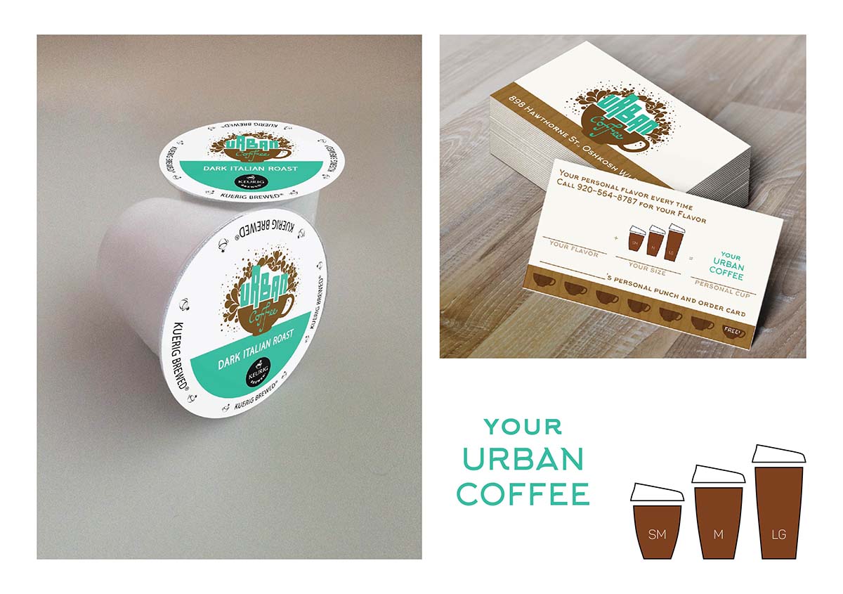
This logo was created with limitations in mind. In it's full glory, this logo is 3 colors to show off the whip cream. However, for some applications where the budget may be tighter the logo easily simplifies to 1 or 2 colors when on white (see K-cups).
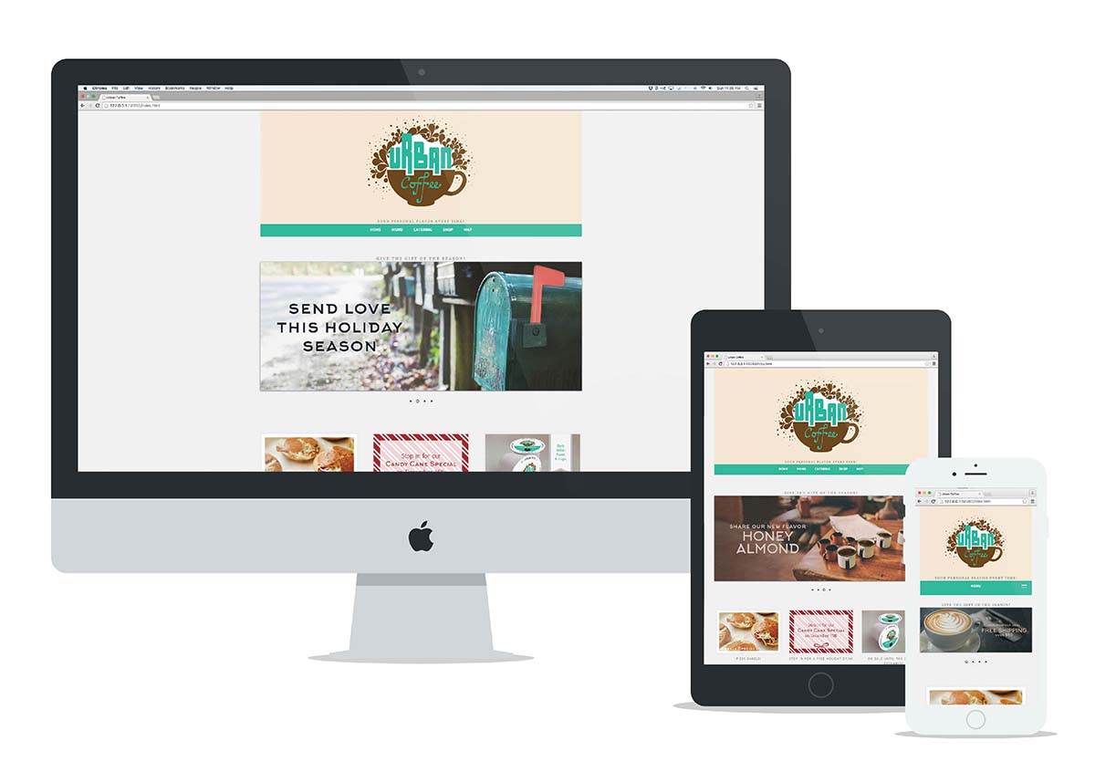
This website with advertisements was created for online orders so that customers could order the same coffee served at their favorite Urban Coffee shop.
Visit Urban Coffee
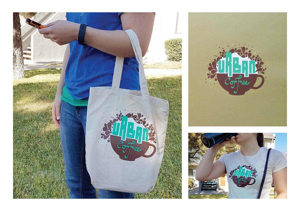
From beginning to end, this logo works on any application. Shown is some real screen-printed swag. This logo has been hand-printed on a canvas bag, cream heather shirt and several craft paper stocks.
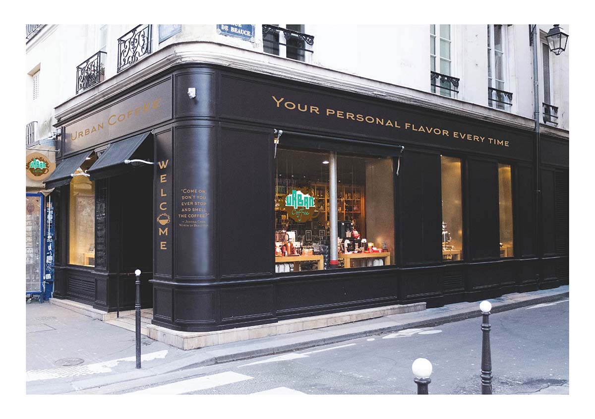
This storefront was rendered to show how an Urban Coffee could be set up in a downtown area.
Copyright © 2022 Brenda Crisafulli Designs · All Rights Reserved
![]()
![]()
![]()